What is Responsive Web Design? Why is it Important?
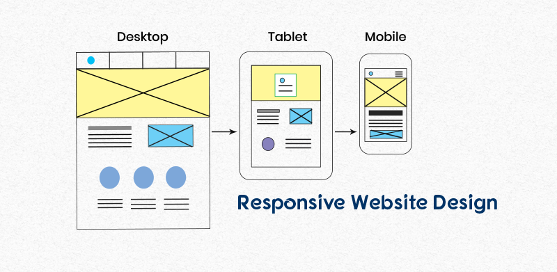
What is responsive web design?
Responsive design is a way of designing a website so that it resizes and respond automatically to the sizes of the different devices. The responsive website has a fluid and flexible layouts which adjust according to the devices it is viewed on. This makes the website looks great on a desktop, a tablet, and a mobile phone’s browser.
The main goal of the responsive design is to minimise the unnecessary zooming, horizontal scrolling and panning while viewing the website contents and improve search engine ranking.
So why you should make your website responsive? Here are a few reasons:
1. Better User Experience
Responsive websites are designed with usability features like fast loading speed and easy navigation, which provide optimised and consistent user experience.
A responsive website provides flexible contents and pages across all screen sizes, which makes the website much easier to navigate and read for the customers who are visiting sites through a different type of devices.
If you don’t want to lose your potential customers just because of unresponsive website, then you should get a responsive website, to provide customers ultimate users experience no matter what devices they’re on.
2. Save time and cost
Website management and regular website updates is a huge job. It becomes overburden when you have a different website for each device.
Responsive website reduces the time and cost spent on the management of a website
as you don’t have to pay extra for the design and management of a dedicated website for mobile devices.
3. Improved Search Engine Ranking
In July 2019, Google enabled the mobile-first indexing by default for all the new websites. It means google predominately uses the mobile version of the content for the ranking rather than desktop-based contents.
This change has come into existence because of the increasing number of mobile users in the past years. As the majority of internet users uses mobile phones, it is obvious for Google to make sure that they get the best user experience. This is why Google recommends responsive websites.
Responsive websites load quickly and provide great user experience with flexible layouts. If you have an unresponsive website, then it will load slowly on different devices and will not be able to provide the required user experience, which will affect website ranking in search results.
4. Future Scalability
The best thing about a responsive website is that it will ensure the best support for future devices and screens of different sizes as they can scale up and down as needed. This means if any device comes in the market with a totally different screen size, responsive websites will be ready to provide the best experience suited for any screen size.
In the end, the beauty of responsive designs lies in its flexible and fluid layout, which is capable of providing a seamless user experience on all devices and help to boost the search engine ranking.
Check If your site is responsive or not?
You can check whether your site is responsive or not by using the helpful Google tool.
Take the Google Responsive Test here.
If your website is not responsive, You can Contact us here.